
Interior Paint Color Visualizer With AI: Preview Wall Colors From a Photo
Use an AI interior paint color visualizer to preview wall colors from your room photo, compare warm neutrals, greens, blues, accent walls, trim colors, and lighting effects before painting.
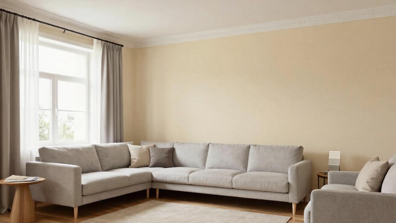
Interior Paint Color Visualizer With AI
Choosing an interior paint color is harder than it looks. A color that seems perfect on a tiny chip can turn too gray, too yellow, too dark, too cold, or too intense once it covers an entire wall. Natural light, artificial lighting, flooring, furniture, trim, and ceiling color all change how paint feels in a real room.
An AI interior paint color visualizer can help you preview wall colors from your own room photo before you buy samples or start painting. Instead of imagining a color in isolation, you can compare warm whites, greiges, taupes, greens, blues, clay tones, accent walls, trim colors, and full-room palettes in the context of your actual space.
AI is not a perfect substitute for real paint samples. Screen colors vary, lighting changes throughout the day, and brands use different formulas. But AI is very useful for narrowing down the direction before testing physical swatches.
If you are new to photo-based redesign, start with AI room design from photo. This article focuses specifically on interior paint color decisions.
Why paint colors look different in real rooms
Paint is affected by everything around it.
A wall color may change depending on:
- North-facing vs south-facing light
- Morning vs afternoon sun
- Warm bulbs vs cool bulbs
- Existing flooring undertone
- Wood furniture tone
- Cabinet color
- Upholstery color
- Trim and ceiling color
- Window size
- Room size
- Gloss level and paint finish
That is why a paint color that looks beautiful online may not work in your room. AI helps because it places the color idea directly inside your photo.
Take the right room photo
A good AI paint preview starts with a clear photo.
Use this checklist:
- Take the photo during daylight if possible.
- Turn on normal room lighting if you usually use it.
- Keep the camera level.
- Include the main walls, floor, windows, trim, ceiling, and major furniture.
- Avoid heavy filters or wide-angle distortion.
- Remove clutter that may distract from the walls.
- Take one photo in the morning and one in the evening if lighting changes dramatically.
- Do not crop out trim, flooring, or ceiling if those colors matter.
If the room has difficult undertones, mention them: orange wood floor, red brick fireplace, gray sofa, beige carpet, cherry cabinets, dark trim, or cool tile.
A good AI prompt for interior paint color previews
Use this prompt:
Preview realistic interior paint color options for this room while preserving the room size, windows, doors, flooring, furniture, trim, ceiling, and architecture. Change only the wall color and related decor accents if needed. Show a cohesive palette that works with the existing light, floor undertones, furniture, and trim. Keep the result realistic and not over-styled.
If you want only paint, make it stricter:
Change only the wall paint color. Do not change furniture, flooring, windows, doors, trim, ceiling, lighting fixtures, or layout.
If you are comparing several directions, try:
Create versions with warm off-white, soft greige, muted sage green, dusty blue, warm clay beige, and a deeper accent wall option.
1. Start with undertones, not color names
Paint color names can be misleading. A color called “linen” may read yellow. A color called “gray” may look blue. A color called “white” may feel stark or creamy depending on the room.
Common undertone families:
- Warm white: soft, creamy, inviting
- Cool white: crisp, clean, sometimes stark
- Greige: gray-beige balance
- Taupe: warmer gray-brown
- Beige: warm and traditional
- Sage: muted green-gray
- Olive: earthier green
- Dusty blue: soft blue-gray
- Clay or terracotta: warm and earthy
- Charcoal: dramatic, grounding
AI can help you compare undertone families before choosing exact paint brands.
2. Match paint to fixed elements
The best wall color works with what is staying.
Fixed elements may include:
- Flooring
- Fireplace stone or brick
- Kitchen cabinets
- Bathroom tile
- Countertops
- Wood trim
- Doors
- Built-ins
- Large sofa
- Carpet
If your room has orange-toned wood floors, a cool gray wall may clash. If your sofa is cool gray, a very yellow beige wall may feel muddy. If your trim is creamy white, a stark white wall may make it look yellow.
Prompt phrase:
Choose wall colors that coordinate with the existing floor undertone, trim color, and main furniture.
3. Compare warm neutrals before choosing white
White walls are popular, but not all white paint is easy.
AI can help compare:
- Warm white
- Soft ivory
- Creamy off-white
- Pale greige
- Light mushroom
- Warm plaster
- Soft beige
- Pale taupe
In many rooms, a slightly warm off-white or pale greige is more forgiving than a pure white. It can make the room feel brighter without making trim, carpet, or wood look strange.
4. Use color carefully in low-light rooms
Dark rooms do not automatically need bright white. Sometimes white walls in a low-light room look flat and gray.
AI can test:
- Warm off-white
- Soft beige
- Light taupe
- Muted sage
- Dusty blue-gray
- Warm clay
- Medium moody green
- Soft terracotta
If the room has limited natural light, ask AI for colors that feel cozy rather than artificially bright.
Prompt phrase:
Choose paint colors that work in a low-light room and feel warm, not dull or cold.
5. Preview accent walls with restraint
Accent walls can work, but they should have a reason.
Good accent wall locations:
- Behind a bed
- Fireplace wall
- Built-in shelving wall
- Dining room focal wall
- Home office video-call wall
- Entry wall with console and art
Avoid random accent walls that do not relate to furniture or architecture.
Prompt phrase:
If using an accent wall, place it on the natural focal wall and keep the rest of the palette balanced.
If you are redesigning a living room, combine paint previews with AI living room design from photo so the accent wall supports the seating layout and focal point.
6. Do not forget trim and ceiling color
Wall color changes how trim and ceiling look.
Options include:
- Keep trim white and change walls only
- Warm white walls with slightly brighter white trim
- Same color on walls and trim for a softer look
- Dark trim for contrast
- Painted ceiling for a cozy effect
- Ceiling one shade lighter than walls
AI can preview these ideas, but be specific. If you do not want trim changed, say so.
Prompt phrase:
Keep existing trim and ceiling color unchanged while changing only the walls.
Or:
Show a coordinated wall, trim, and ceiling palette with subtle contrast.
7. Use paint to connect rooms
Open-plan spaces need colors that transition well.
If a living room connects to a kitchen, dining room, hallway, or entry, AI should preserve visual flow.
Try:
- One main neutral through connected spaces
- Slightly deeper color in dining area
- Same trim color throughout
- Repeated accent color in textiles and art
- Warm neutral walls with bolder decor accents
For open living areas, also see AI living room design from photo.
8. Test room-specific paint ideas
Different rooms can handle color differently.
Bedroom
Bedrooms often work well with soft, restful colors: warm off-white, muted green, dusty blue, clay beige, taupe, or soft plaster. For bedroom-specific constraints, see AI bedroom design from photo. If the room is for a baby, choose calmer, lower-contrast palettes and avoid visually busy walls behind the sleep area.
Bathroom
Bathrooms need colors that coordinate with tile, vanity, and lighting. If you are changing more than paint, see bathroom remodel ideas with AI.
Home office
Home offices need colors that support focus and video calls. Muted greens, warm neutrals, blue-gray, and soft taupe can work well. See home office design ideas with AI for desk and lighting constraints.
Entryway, basement, kitchen, and dining
Entryway, basement, kitchen, and dining paint should coordinate with flooring, cabinetry, table wood tone, chairs, hardware, lighting, ceiling height, and nearby rooms. For non-renovation kitchen updates, see kitchen refresh ideas with AI. For dining, foyer, and low-light lower-level spaces, keep colors connected to nearby rooms and test how the palette looks in both daylight and evening lighting.
9. Avoid common AI paint visualizer mistakes
AI paint previews can be helpful but imperfect.
Watch for:
- Furniture color changed without asking
- Flooring changed
- Trim or ceiling changed unintentionally
- Windows or architecture altered
- Wall color too uniform with no shadows
- Color not respecting real lighting
- Unrealistic saturation
- Brand paint colors invented incorrectly
- Accent wall placed randomly
- Existing undertones ignored
- Room over-styled so paint is hard to judge
If this happens, regenerate with stricter instructions: “change only the walls,” “preserve trim,” “preserve flooring,” and “keep existing furniture.”
10. Always test real paint samples
Use AI to narrow the list, then test physical samples.
Best practice:
- Pick 3–5 color directions with AI.
- Find real paint colors close to those directions.
- Order peel-and-stick samples or sample pots.
- Test on multiple walls.
- Check morning, afternoon, and night.
- Compare with trim, flooring, and furniture.
- Choose finish level based on room use.
AI can help you avoid wild guesses, but real paint should be checked in real light.
Interior paint AI checklist
Before choosing a color, confirm:
- Does it work with flooring undertone?
- Does it work with trim and ceiling?
- Does it work in daylight and at night?
- Does it complement main furniture?
- Does it connect with nearby rooms?
- Is the color too saturated for a full room?
- Does the accent wall have a reason?
- Are you changing only paint or the whole palette?
- Have you tested real samples?
- Does the color support how the room should feel?
How Roomagic can help
Roomagic lets you upload a real room photo and generate paint and design directions across different styles, budgets, and quality levels. For paint previews, the key is to be clear about what should stay the same.
Try this Roomagic prompt:
Preview realistic interior paint color options from this photo. Preserve the room size, windows, doors, flooring, furniture, trim, ceiling, lighting fixtures, and architecture. Change only the wall color and small coordinating decor accents. Choose colors that work with the existing light, floor undertone, trim, and furniture. Show a calm, cohesive, realistic palette.
For rental homes, combine this with the renter-friendly room makeover guide, especially if painting is not allowed.
FAQ
Can AI show paint colors in my room?
Yes. AI can preview different wall colors using your room photo, helping you compare undertones and palettes before buying samples. It is best used for narrowing directions, not final color approval.
Is an AI paint color visualizer accurate?
It can be directionally useful, but it is not perfectly accurate. Screen calibration, camera exposure, lighting, paint finish, and real pigments can all change the final look. Always test physical samples.
What should I include in an AI paint prompt?
Tell the AI to preserve flooring, furniture, trim, ceiling, windows, doors, lighting fixtures, and architecture. Ask it to change only wall color unless you want a broader redesign.
What paint colors make a room look bigger?
Light warm neutrals, soft off-whites, pale greiges, and low-contrast palettes often make a room feel larger. But the best color depends on light, flooring, trim, and furniture.
Should I paint an accent wall?
An accent wall works best when it highlights a natural focal point, such as a bed wall, fireplace wall, built-in wall, or home office background. Avoid random accent walls with no design purpose.